Pattern Library
This is our interactive collection of designs and layouts, patterns, slices and components with the view to making these available. It is a living document and these guidelines keep changing, accordingly.
Primary page content
Accessibility, readability and warmth
- Layout
- Colour
- Typography
- Iconography
- Reference [PDF]: William Lidwell, Kritina Holden, Jill Butler - Universal Principles of Design
- Research [online]: w3.org/WAI/fundamentals/accessibility-principles/
Users on the go
Layout: supporting and related content
Layout: no 2nd column
Typography: headings
Typography: links
- Example #1
- Research [online]: nngroup.com/articles/clickable-elements/
- Implications for UX Design - Professional services
- Implications for UX Design - Study
- Implications for UX Design - Homepage
- Homepage keyboard interaction for accessibility
- Homepage menu keyboard interaction for accessibility
Patterns showcase
Information standout and calls to action (CTAs)
- Highlight
- Information or alert notice standout
- Emergency and crisis support
- Button with variations
- Download
- Contact
- Read
- Go to... and Report
- Question
Calls to action (CTAs) with forms, error handling, and success message
- Research [online]: nngroup.com/articles/required-fields/
- Research [online]: nngroup.com/articles/errors-forms-design-guidelines/
- Standard space
- Enhanced general page space
- 50/50 hero
Images, video, photo gallery and other slices
Quote (framing words)
Side box
UX Design testing for accessibility, readability and warmth
Usability testing (readability and warmth) methodology
- Information sheet
- Consent form
- All documents [PDF]
Designs for usability testing: first five participants
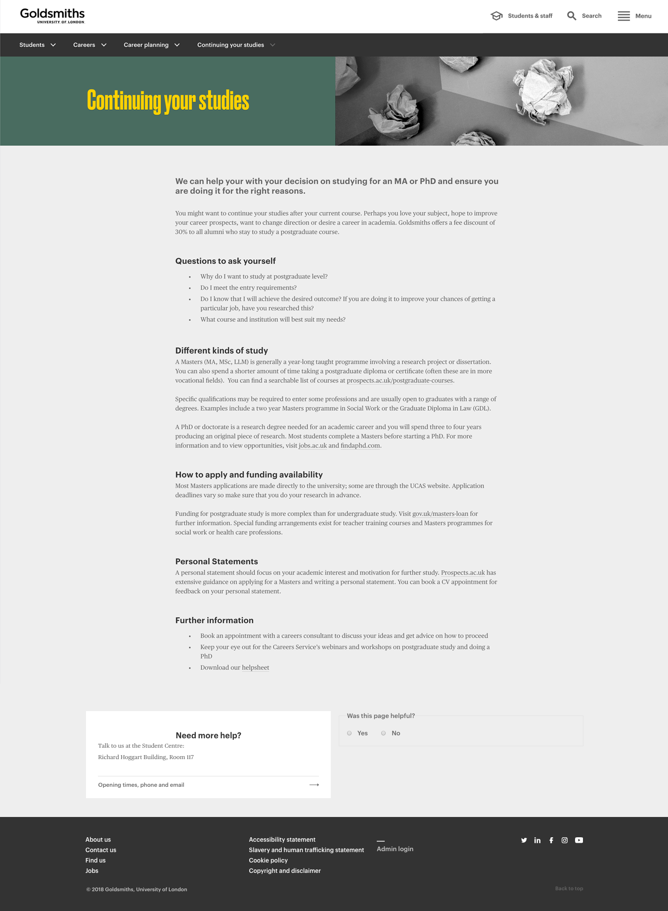
- Route A [current design]: gold.ac.uk/careers/planning/continuing-your-studies/
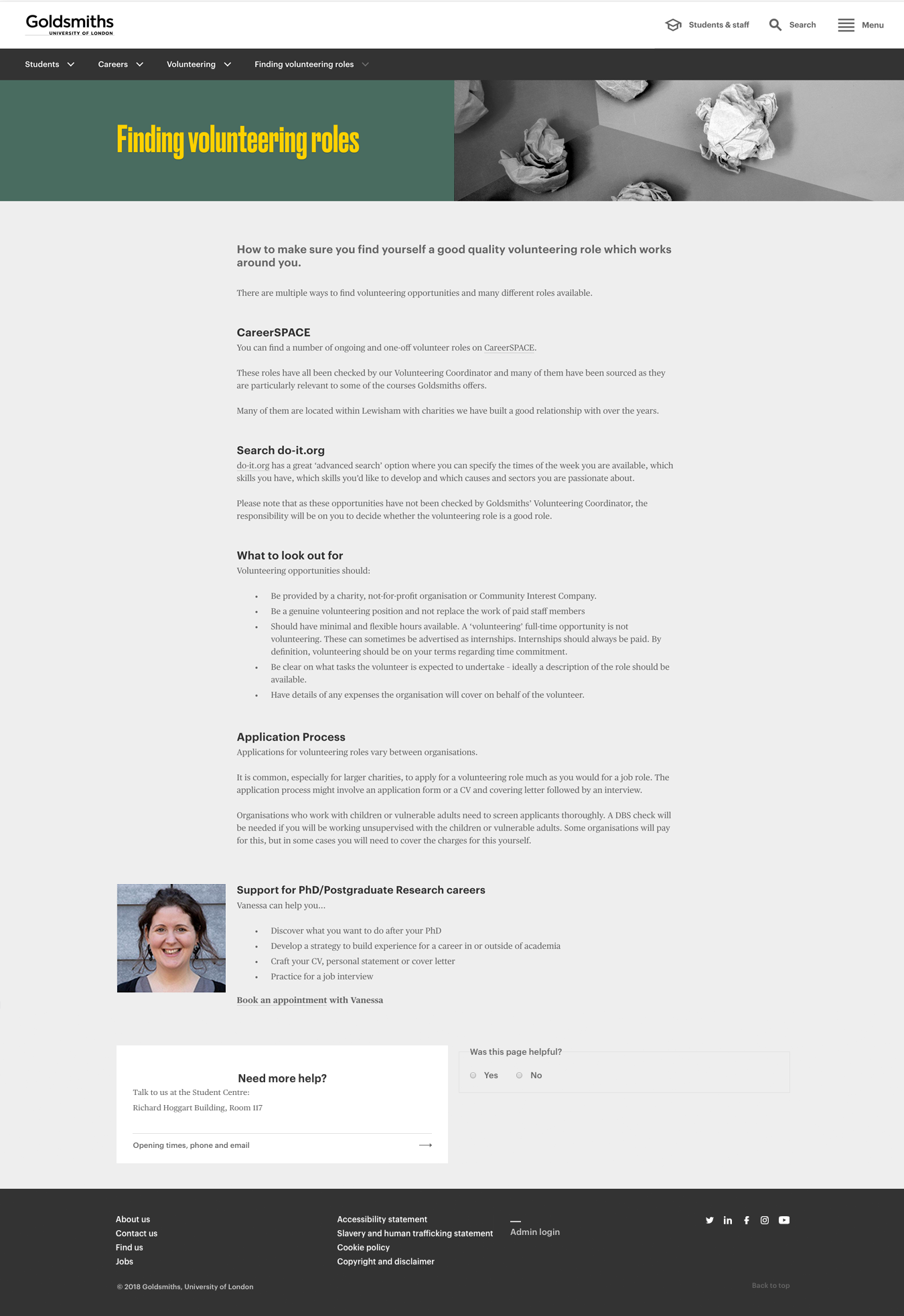
- Route B prototyped page for testing: gold.ac.uk/careers/volunteering/finding-roles/
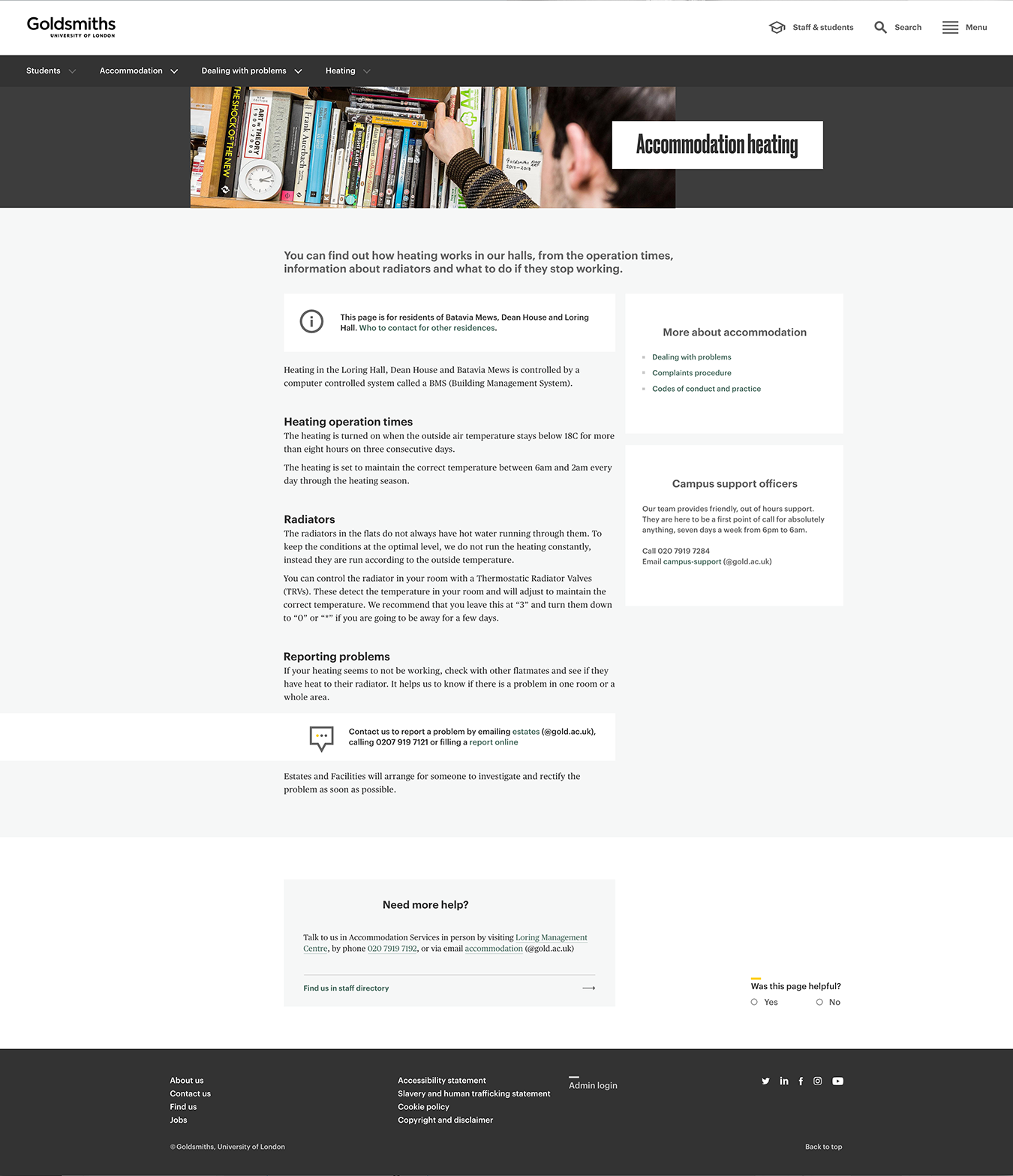
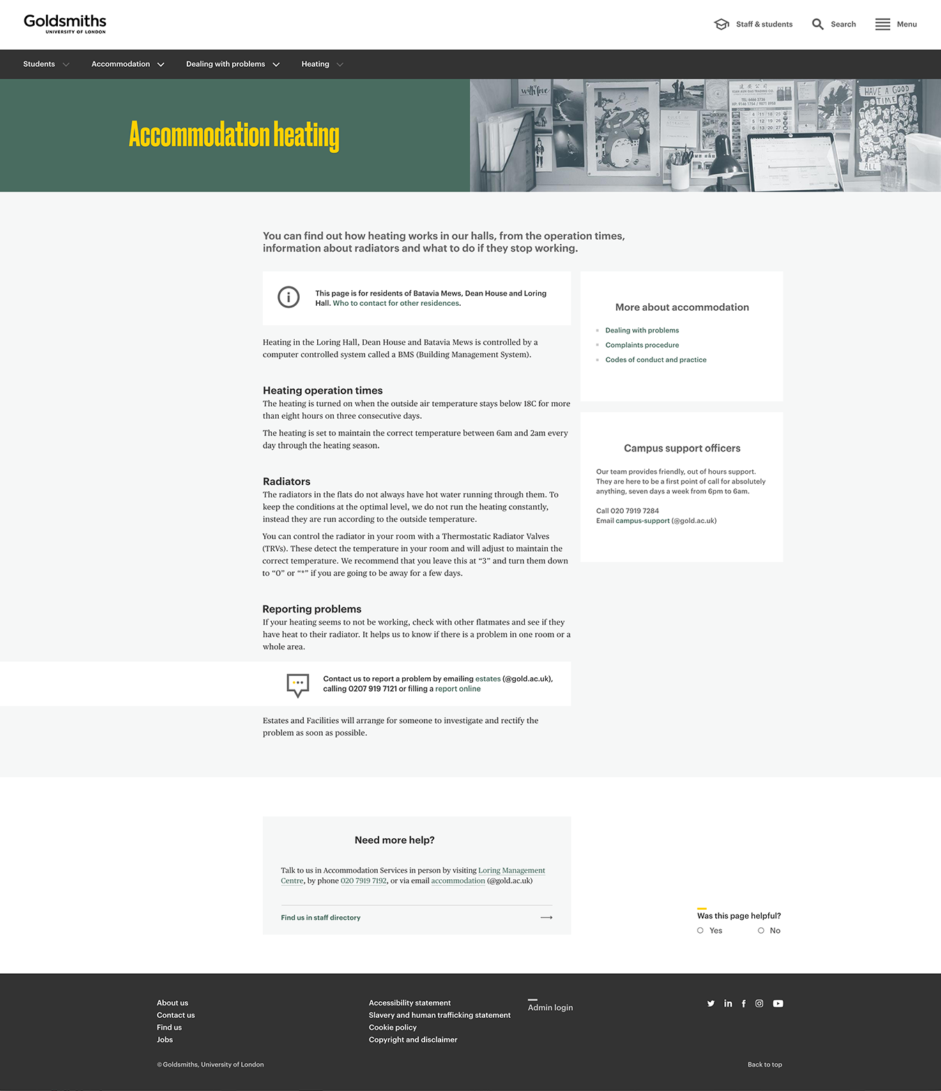
- Route B prototyped page for testing: gold.ac.uk/students/accommodation/problems/heating/
Designs for usability testing: second five participants
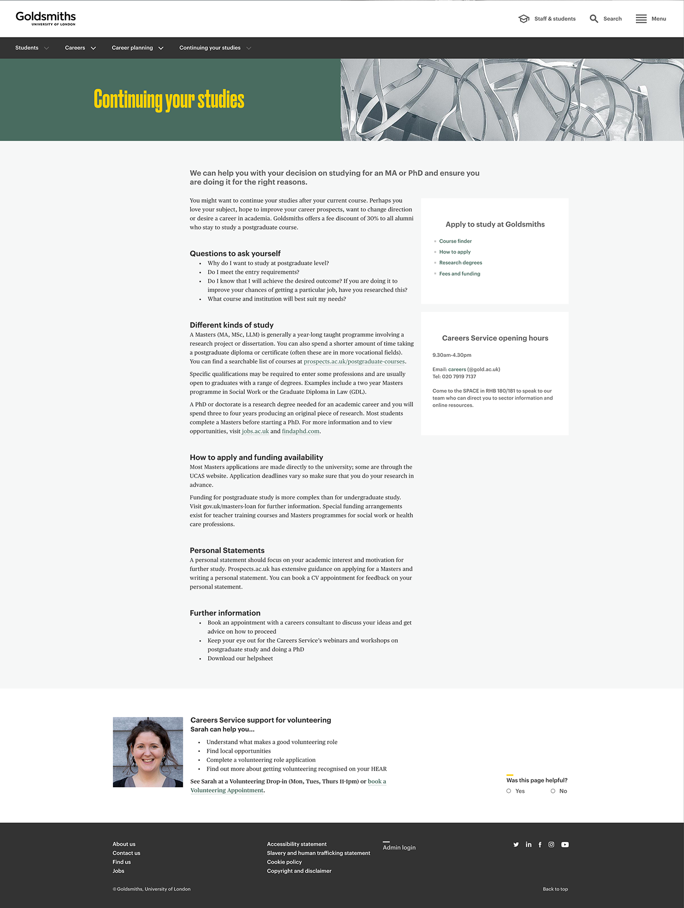
- Route B prototyped page for testing: gold.ac.uk/careers/planning/continuing-your-studies/
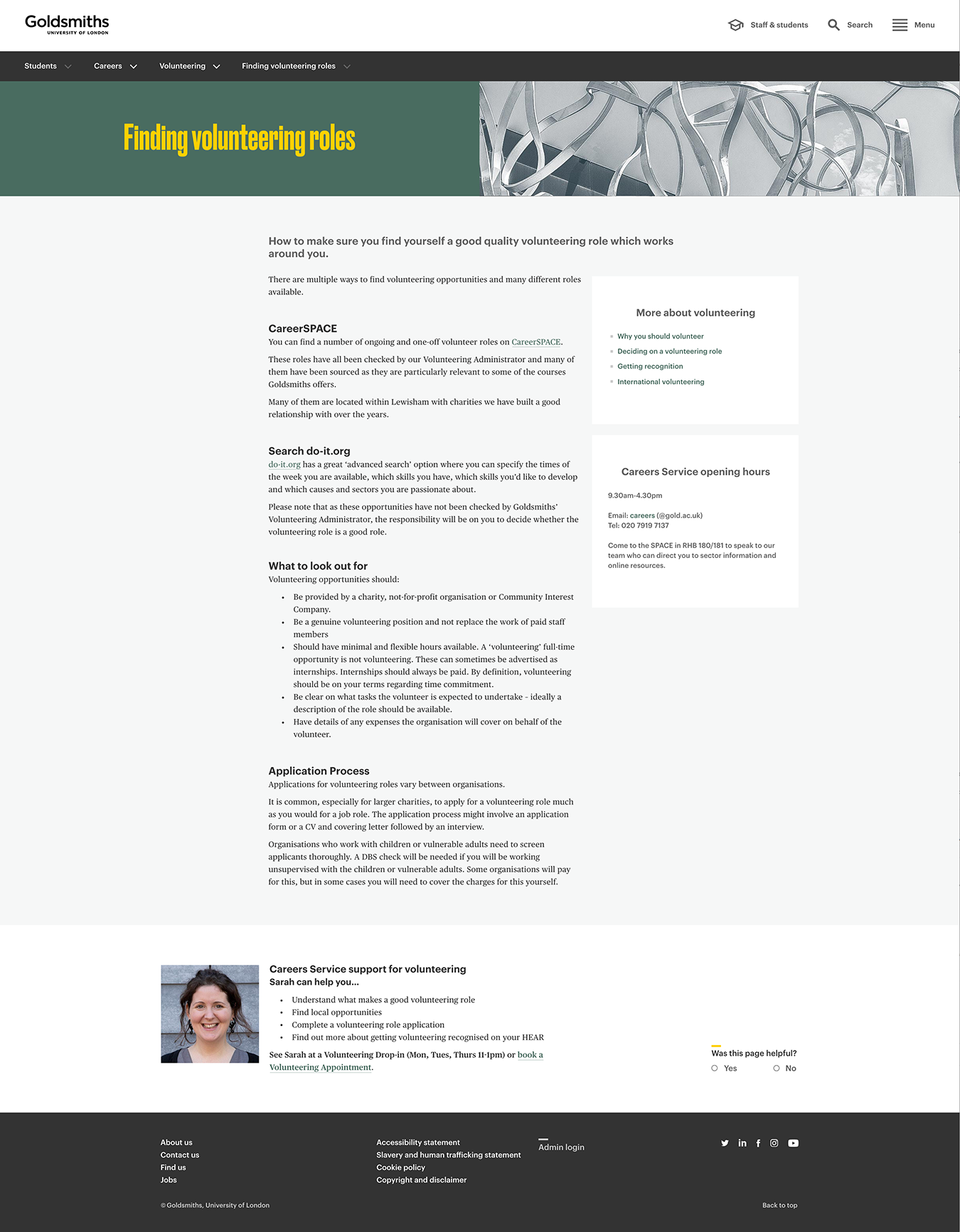
- Route A [current design]: gold.ac.uk/careers/volunteering/finding-roles/
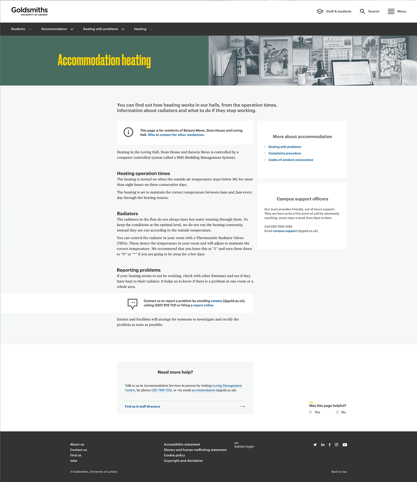
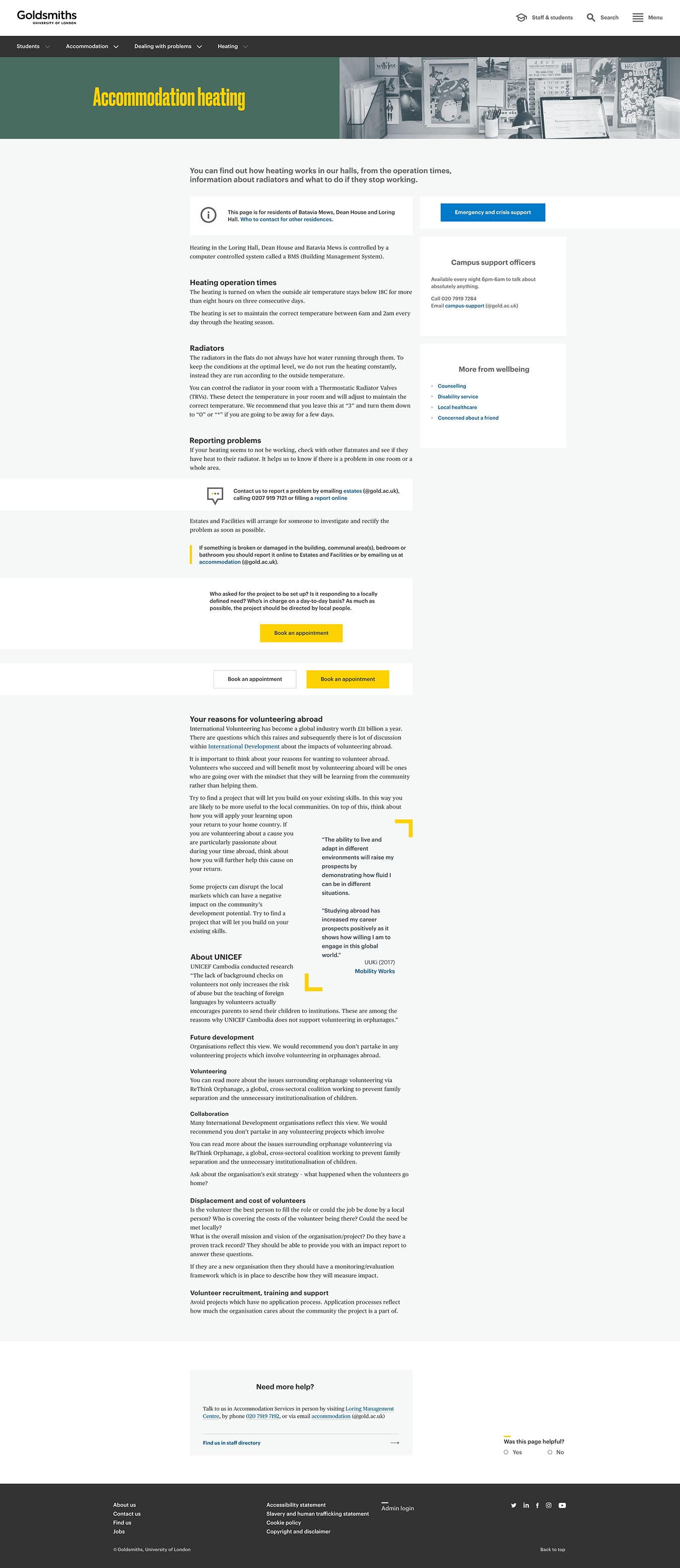
- Route B prototyped page for testing: gold.ac.uk/students/accommodation/problems/heating/
Evaluation report - 1st round of testing: Please contact us to find out more about the findings
DigInclusion prototypes for accessibility testing
- Route A prototyped page for testing: Prototype#1
- Route A prototyped page for testing: Prototype#2
- Route B prototyped page for testing: Prototype#3
- Route B prototyped page for testing: Prototype#4
Evaluation report by DigInclusion - 2st round of testing: DigInclusion Report [PDF]
Previous research
Full information from five personas by Numiko (Aug, 2014) [PDF]
- Leila: Current student, Masters
- Lynda: Parent (Influencer)
- Hua: Prospective International, Masters
- Tamina: Prospective London-based, Masters
- Jack: Prospective non London-based, Undergraduate
Design specs
Project link [XD]: xd.adobe.com/spec/4862caf7-062c-4972-b49e-f9a25cc71f39-1d31/grid
Project link [Zeplin]: app.zeplin.io/project/5c376480bbe14e29b6e76b8c/dashboard