Chromorama: David Batchelor’s tower of urban colour comes home to Goldsmiths
Primary page content
The newest creative addition to New Cross, Chromorama is a 20-metre tower of light and colour and the work of internationally acclaimed artist David Batchelor. We explore its inspiration and why its location in southeast London marks a return home.
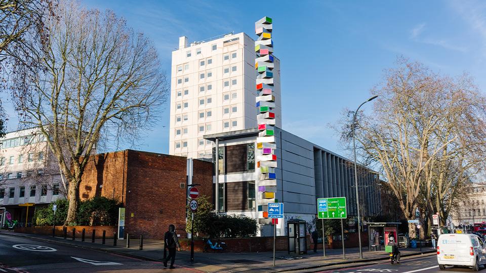
Chromorama, a 20 metre tower of light, takes pride of place at Goldsmiths
Described by Batchelor as “a vehicle for colour”, Chromorama marks the latest chapter in a 30–year exploration of how colour operates in cities – culturally, politically and emotionally – and why, for much of modern Western art, it was something to be resisted or even feared.
“I’ve been working with colour as a subject for over 30 years,” Batchelor explained. “When I went to art school in the 70s, no one was really doing colour. It was conceptual art, minimalism – very austere, very black and white and grey. So, in some respects, stumbling into colour was a surprise to me and to most of the people I knew at the time.”
“I started wondering why there was this absence of colour in a lot of contemporary art,” he said. “And then, by extension, an absence of colour in a lot of Western writing, in philosophy and art. I wanted to make work where colour was the centre of the work, not just a subsidiary element of it.”
Urban Colour After Dark
Batchelor describes himself as “a city boy”, and it is the colours of the city, not nature, that have shaped his practice.
In cities, the best colours come out at night. The city, which is largely grey during the day, it's in the night that it begins to glow.
David Batchelor
While landscapes and seascapes have long occupied painters, Batchelor turned instead to illuminated urban colour – light boxes, neon, and later LEDs – as they appeared on shopfronts, office blocks and streetscapes. “If I'm interested in colour in the city, then I better look at illuminated colour, because that's a prominent form of it,” he noted.
In the late 1990s and early 2000s he began salvaging old light boxes from clearance yards around Brick Lane and beyond. “I got to know these guys quite well, and they used to go and find light boxes for me. I began to make these towers with re-lit and recoloured light boxes, and they were all recycled materials.”
Urban colour, for Batchelor, is chemical, electrical and industrial – a palette of Dulux tins, spray cans, plastics and illuminated signage – and it changes with technology and economics as much as with the weather.
The palette of urban colour comes from tins of paint - from spray paints, from plastics. It’s industrial colour, and I like that sense of it being a very everyday kind of material.
David Batchelor
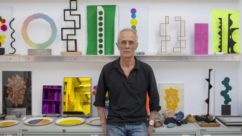
David Batchelor photographed by Lucy Dawkins
Battling Chromophobia
Batchelor’s artistic practice runs in parallel with his influential writing on colour, especially his 2000 book Chromophobia, which has become a key text in art and cultural theory. The book grew from an essay written to describe what he saw as a persistent resistance to colour in Western culture.
“I was trying to describe what I'd begun to notice, this resistance to colour in the West, this tendency to marginalise colour and to treat it as other to the workings of the higher Western mind,” he said. “I kept thinking, well, actually, there's a slightly bigger story here.”
That story, he argues, goes back to the Bible and to classical philosophy. “In the Bible, ‘though your sins be as scarlet, they shall be as white as snow’ – the idea that white is virtuous and good, whereas vividly coloured things suggest the appetites. They suggest sensuality and less noble ideas.”
Plato, he notes, dismissed colour as a distraction suitable for “women and children” – a prejudice that echoes through centuries of art theory.
“You find a lot of this placing of colour as not Western but Eastern, not male but female, not adult but infantile, as exotic and other,” Batchelor said. “And it still lurks around."
The conceptual art I was brought up with saw itself as serious, philosophical and political – and there's no colour in it. You can't do pink and call yourself philosophical, it seems. I don't know why not.
David Batchelor
While he does not see his role as preaching, he is clear that his work and writing are part of an ongoing argument for colour’s seriousness and complexity. “In a way, my job is not to overturn it, but to draw attention to how we tend to place these experiences that are common to pretty much everyone, how we almost unconsciously place them within our lives,” he said.
Chromorama: A Tower of Light for New Cross
Chromorama was originally commissioned for a corporate site in the City of London, where its illuminated panes of colour stood out against what Batchelor calls “some fairly generic new buildings”. Now re-homed at Goldsmiths with support from British Land, the work has been structurally re-engineered for its new public setting.
In the studio, Chromorama began as a small, handmade model – a vertical stack of intersecting planes and colour fields. Batchelor shared this mini conception of his sculpture to the engineering team that were charged with bringing it to life outside his Bromley-by-Bow studio. “I said, ‘Okay, I'm going to make that 20 metres tall and glow in the dark.’ They came up with the engineering solution.”
Unlike his earlier studio pieces, Chromorama is not built from salvaged materials – “It's impractical in those circumstances,” he said – but the logic is the same: colour as a vivid interruption in a largely grey urban fabric.
“Most buildings in any city environment are neutral, more or less,” he said. “Brick, stone, steel, glass… earth colours to grey. For me, that's a great canvas to work with, because it allows me to do vivid colouring, to counterpoint those rather more stable colours with rather more vivid ones.”
Installed adjacent to Goldsmiths main campus, Chromorama acts as both landmark and provocation – a vertical column of colour confronting the traffic of New Cross Road and the daily flow of students and staff.
Coming Full Circle at Goldsmiths
For Batchelor, the locating of his colour tower at Goldsmiths is deeply personal. “The first bit of teaching I picked up in London was at Goldsmiths, in about 1985 or 86,” he said. “The first place in London that I exhibited as an artist was in the octagonal building next to where Chromorama is going to be. That was around 1989.” Over subsequent decades he taught seminars in the Fine Art department, became a professor, and is now an Emeritus Professor at Goldsmiths.
“I both have exhibited and taught there, and now I'm going to sort of tower over it,” he joked. “For me, you couldn't have made it up, really.” He sees the relocation as a way of acknowledging that relationship.
“I've got quite a lot out of Goldsmiths over the years – it's helped me sustain my practice and keep me going,” he said. “To be able to then say, ‘Well, okay, thank you. Have this,’ is kind of nice – especially if it's not costing me.”
As the winter draws in and Chromorama lights up New Cross, Batchelor hopes for something simple but demanding; not reverence, but attention and delight.
I generally don't like art that's didactic, that wants to wag its finger at me or teach me a lesson.
David Batchelor
“Art for me can be about pleasure, delight – just going, ‘I like that,’ like a firework display almost. I would always want the first thing that someone would see in the work to be vivid colour, simple shapes, and not feel they're having to be taught a lesson about anything. It should be an invitation to look – and maybe no more than that.”